Voter Education
and Reformation App
An educational app for voters to demo various voting methods and outcomes, access voting resources, and find community through volunteer opportunities.
The design process for the first clinician–focused mobile app, integrated with a surgically implanted insulin pump providing life-saving insulin therapy for people living with diabetes.
Role
UX Designer UX Researcher
Role
UX Designer UX Researcher
Tools
Figma Miro
Duration
June-July 2022
Duration
June-July 2022
1
1
Voting Demos let users experience different systems in action.
2
2
View the results right away to see how votes are counted.


3
Straight forward messaging helps educate users, find resources, and share what they’ve learned online.
Design Process
Design Process
Understand
Understand
User Research
Interview
User Personas
Journey Map Competitive Audit
User Research
Interview
User Personas
Journey Map Competitive Audit
Define
Define
Brainstorming
Information Architecture
Personas
Storyboards
Brainstorming
Information Architecture
Personas
Storyboards
Ideate
Ideate
Wireframes
User Flows
Lo-fi Designs
Wireframes
User Flows
Lo-fi Designs
Prototype
Prototype
User Interactions
Visual Mockups
Hi-fi prototypes
User Interactions
Visual Mockups
Hi-fi prototypes
Understand
Understand
Usability Study Affinity Diagram User Tests
Usability Study Affinity Diagram User Tests
Implement
Implement
Refining Designs
Next Steps
Documentation
Refining Designs
Next Steps
Documentation
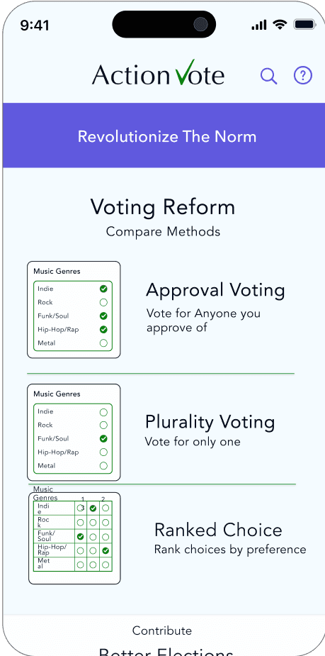
Understanding the Product
Understanding the Product
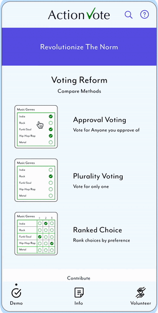
ActionVote is an educational voting app that teaches users about voting reform by allowing them to test voting methods, find volunteer opportunities, & utilize voter resources to learn about better ways to vote.
ActionVote is an educational voting app that teaches users about voting reform by allowing them to test voting methods, find volunteer opportunities, & utilize voter resources to learn about better ways to vote.
replace description
replace description
Purpose and Vision
Purpose and Vision
We have the power to make positive change!
Do you want your vote to have a higher impact? Do you want to feel like your voice matters more? We can make it happen together with a better way to vote. Help educate others about voting reform!
ActionVote gives you a tool to test and compare different voting systems, find volunteer opportunities within your community, and share voting reform information to help revolutionize the vote.
What is the impact?
What is the impact?
ActionVote provides a usable, easy, educational interactive demo to directly test and evaluate voting methods., resulting in better informed voters to contribute and take action towards positively changing the current political systems.
ActionVote provides a usable, easy, educational interactive demo to directly test and evaluate voting methods., resulting in better informed voters to contribute and take action towards positively changing the current political systems.
What is the problem being solved?
What is the problem being solved?
Design for the greater good by enlightening communities about better elections through an educational voting reform app.
Design for the greater good by enlightening communities about better elections through an educational voting reform app.
Mobile App Lo-fi
Prototype Interaction
Mobile App Lo-fi
Prototype Interaction

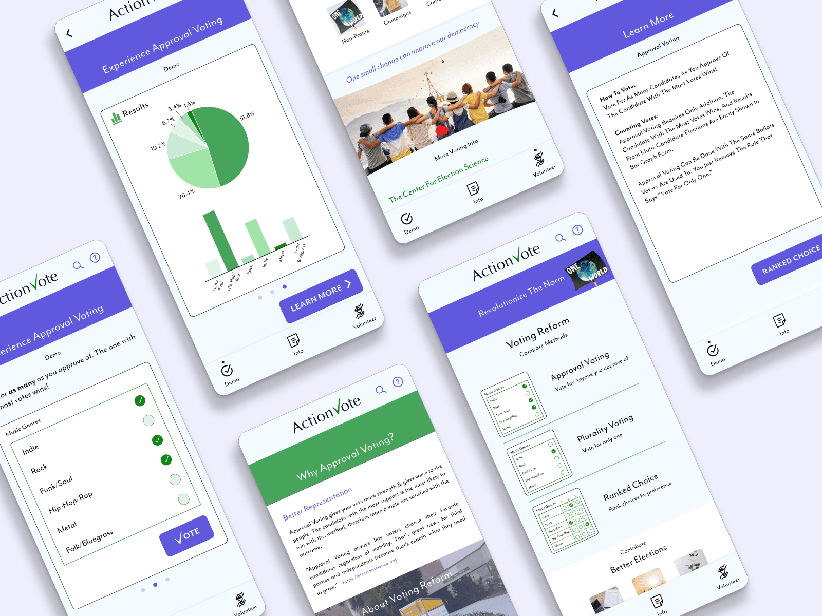
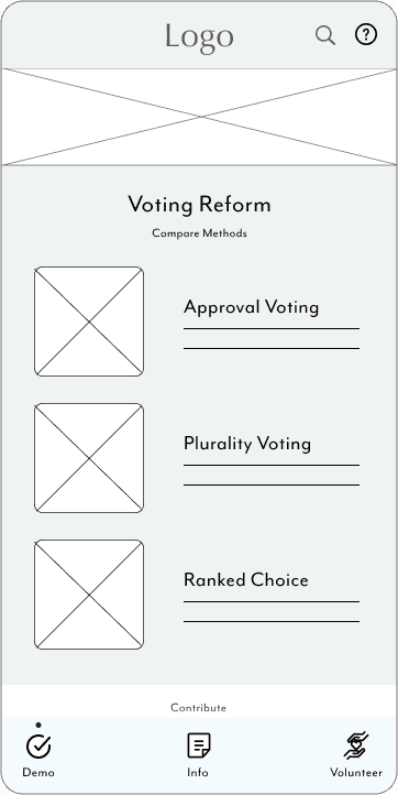
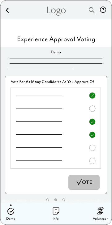
The low-fidelity prototypes demonstrate the primary user flow from the home screen, to testing the first demo for approval voting, to viewing the results, & moving forward to compare the next voting methods.
The flow was represented in the unmoderated usability study to assess the time it took users to navigate the desktop site, as well as any accessibility issues (see Maze test).
Understanding the User
Understanding the User
Users want their vote to matter, to stay informed on voting policies, & to volunteer for voting reform in order to change the way we vote.
Creating an educational voting app required understanding the knowledge & resources that users need. Questions I considered: What do users need from an informational voting app? Which features, interactions, or resources do people need for the best educational experience? How do we demonstrate different voting systems to users in a way that feels easy, understandable, & satisfying?
Using the primary research method, I conducted interviews, surveys & usability studies of people within my community. My predictions of what users want or need from the app include voting demos, volunteer resources, & informational articles about voting reform.
Other research methods used include a user test which measured KPI’s such as navigation/search & user error rates through rapid testing prototypes.
Interviews
Interviews
To find the proper recruitment of people, I surveyed and identified people of differing ages & interests, who are active in the community, & have a basic understanding of the current voting system.
When preparing the script, I was careful to ask questions with neutral wording to allow participants to feel comfortable. I kept the questions simple, but open enough for participants to expand on their experiences with voting if they choose. Although the interview topic was primarily around voting specifically rather than politics, I made it clear to participants that all of their information & answers are anonymous. To create a light, pleasant environment, I also informed users that they did not have to answer a question if they felt uneasy. In this phase, it was important for me to be unbiased and listen carefully for any frustrations.
The interviews were conducted in person & online. I asked straight forward questions & interacted using neutral terms to allow the participants to elaborate & express any needs or pain points.
A few questions I asked included:
“What types of voting methods are you familiar with? Can you describe the voting methods you’re familiar with to the best of your ability?”
“Are you open to learning about new voting systems or options for United States elections?”
“If you were to search for resources on learning about different voting methods, where would you think to look? Are there particular websites, channels, radio stations, or news platforms that come to mind?”
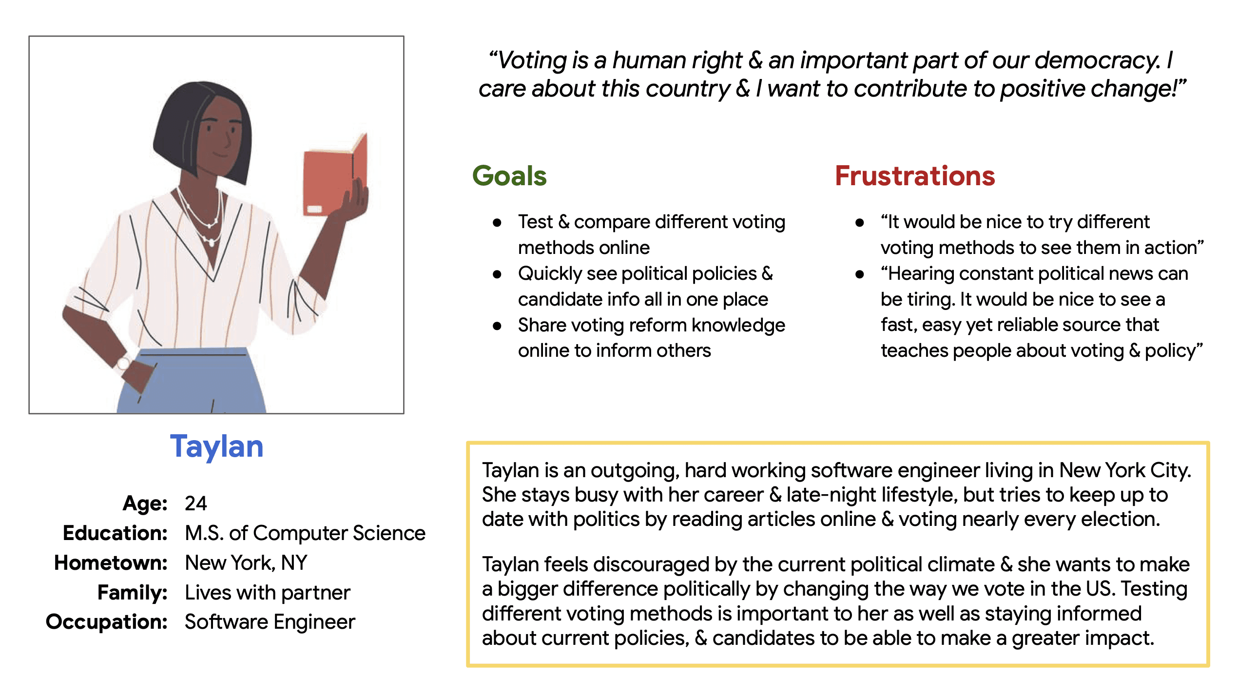
Personas
Personas
After conducting interviews, I combined lifestyle similarities to generate personas and user stories. This step was key to the design process because it reflected real challenges that users may face and it allowed me to empathize with their needs in order to identify frustrations.
After conducting interviews, I combined lifestyle similarities to generate personas and user stories. This step was key to the design process because it reflected real challenges that users may face and it allowed me to empathize with their needs in order to identify frustrations.
Pain Points
Pain Points
Based on the Interviews and user persona research, I found 3 major pain points to address in my designs.
Based on the Interviews and user persona research, I found 3 major pain points to address in my designs.
Key Insights
Key Insights
Originally, the Implant Procedure was not included in the app, and it was purely a physical procedure without needing instructions or guidance specific to this device.
• Different patients need different sized catheters. This led to the realization that the clinicians would need to input catheter and patient data prior to implant; meaning it was necessary to build a user flow for Implantation surgery.
• Another key discovery was that the clinician home screen would look different pre-implant. visualizing the initial home screen for the app. An important question I asked to spark the results was “what are all of the navigational options for the user (clinician) prior to implant, if they have logged into the app but have yet to select/connect to the patient?”
• The conclusion we came to was how to visualize the Implantation start screen, involving pump diagnostics summarizing the pump alarm status, battery status, and similar data to indicate whether the pump is ready to be assigned to a patient for implantation.
Defining the Product
Defining the Product
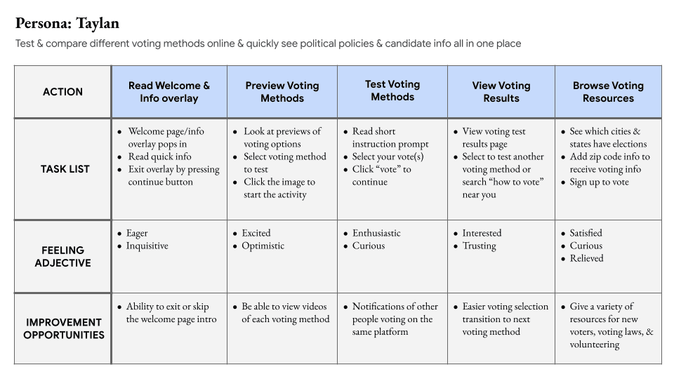
Storyboards and Task Flows
Storyboards and Task Flows
The journey map revealed features users might need from an educational voting app to spark engagement. These features include testing & comparing different voting methods, quickly see political policies & candidate info all in one place, share voting reform knowledge online to inform others.
The journey map revealed features users might need from an educational voting app to spark engagement. These features include testing & comparing different voting methods, quickly see political policies & candidate info all in one place, share voting reform knowledge online to inform others.
Project Site Map: Voting App Navigation
Project Site Map: Voting App Navigation

Creating the site map based on the user flowchart provided the information architecture of the app and brought the vision together of what the demos might look like in practice. The result demonstrates the navigation and layout of the app to guide users through the voting demos, information, and volunteer opportunities.
Creating the site map based on the user flowchart provided the information architecture of the app and brought the vision together of what the demos might look like in practice. The result demonstrates the navigation and layout of the app to guide users through the voting demos, information, and volunteer opportunities.
Ideation and Creating the Designs
Ideation and Creating the Designs
Sketching wireframes
Sketching wireframes
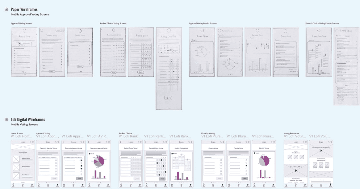
Sketching out design ideas on paper allowed me to visualize the layout of the voting demos, and to plan the information architecture of the experience in the next part of my design process. The first screen options were originally designed to direct users straight to the voting demo.
Paper wireframing also enabled me to problem solve & creatively design based on the users accessibility needs & priorities from the pain points.
Design Iterations
Design Iterations
The digital screens for mobile app were designed to give users choices for navigation, while keeping the key goal in mind of educating people about voting reform by directing users to the demos first.
The digital screens for mobile app were designed to give users choices for navigation, while keeping the key goal in mind of educating people about voting reform by directing users to the demos first.
Interactive Prototypes
Interactive Prototypes
Visual Mockups
Visual Mockups
We focused our efforts on designing the initial look of the app from the ground up, based on field experts input and testing.
We focused our efforts on designing the initial look of the app from the ground up, based on field experts input and testing.
This low fidelity design flow shows how the user moves through the voting demos from Approval Voting to Ranked Choice Voting results.
Responsive Site Mockups
Responsive Site Mockups
The website screen variations are displayed similarly across devices. Primary differences include adding more height to the hero image with space to add text & moving the demo cards from a vertical layout to a horizontal layout.
As seen in the high fidelity prototype below, the experience for Approval voting demos remain the same, using a carousel that swipes horizontally after voting to view the results. Overall, I stuck with a minimalist design & color scheme in order to draw attention to the information & make it as clear as possible.
Testing
Testing
Usability Study Parameters
Usability Study Parameters
I conducted a usability study of my lo-fi prototype to determine if users encounter difficulties navigating the voting demos or understanding the results.
The unmoderated usability study I conducted was a remote, 10-15minute click-through of the lo-fi prototype observing 5 participants between 22 and 40 years of age. It included a System Usability Scale (SUS) survey, conducted anonymously, as a quick follow-up to empathize & understand the users reactions.
I gathered notes based on participants’ thoughts, feelings, challenges, & suggestions from the user study. By categorizing the notes into an affinity diagram, I was able to identify patterns & themes around their experiences with testing my prototype.
Next, I formulated insights based on these patterns to innovate & improve my designs.

Wireframes description
User Test: Findings
User Test: Findings
Conducting usability studies for the mobile app exposed key user needs in order to positively experience the app flow. Findings from the study show that users had difficulty with navigation, iconography/imagery, & context within the app.
I added screens & made changes to the app based on these key research insights.
Insights
Insights
Navigation
Users had difficulty navigating the Ranked Choice Voting demo, therefore the RCV ballot needs more visual cues, textual hierarchy, & consistency
Iconography
Users were confused by what some of the icons represent, therefore the iconography design could be more intuitive
Context
Some users need context to help direct them through the app. An insight is to add text, visual elements, & animations
Results
Results
ActionVote contributes to the greater good by providing a usable demo to directly test voting methods that will inform the user through their app experience. The best way to understand Approval Voting, Ranked Choice Voting, and our current system of Plurality Voting is through experiencing and observing them in action.
“It’s a really helpful app to visualize the different types of voting modalities.”
- Usability Test Participant“Great job! Keep up the good work!” - User Feedback
Considerations
Considerations
The assistive features of the app include providing text with the icons for easier understanding navigation & for screen reader access.
Another accessible aspect includes the text hierarchy that makes it easier to view key sections, or skim text, as well as using it with a screen reader.
The assistive features of the app include providing text with the icons for easier understanding navigation & for screen reader access.
Another accessible aspect includes the text hierarchy that makes it easier to view key sections, or skim text, as well as using it with a screen reader.
Next Steps…
Next Steps…
Color: Make adjustments to the color theme; populate the screens with subtle color contrast such as borders, shadows, and image effects
UX Writing: Edit the text & contribute more information to the app based on real sources & references
User Flow: Create a secondary flow for the volunteer screen & voting resources
User Research: Conduct a third round of research; apply changes based on new research insightsAnother accessible aspect includes the text hierarchy that makes it easier to view key sections, or skim text, as well as using it with a screen reader.


Clinician Mode
12:25
80%

Chess Club


Ranked Choice
Experience Approval Voting
9:41
Demo
Volunteer
Info
Demo
Action ote

Vote for as many as you approve of. The one with
the most votes wins!
Rock
Indie
Funk/Soul
Hip-Hop/Rap
Folk/Bluegrass
VOTE
Music Genres
Experience Approval Voting
Demo
Action ote
Volunteer
Info
Demo
Voting for your favorite
Removes vote splitting almost entirely
Fewer spoiled ballots
Elects more consensus winners; greater voter satisfaction
Results are easy to understand
Alternate candidates get a more accurate measure of support
Ballots look the same, with the added note that you may vote for any number of candidates instead of only one
Benefits
Why Approval Voting?
Action ote

register

Volunteer

Learn
Better Elections
Contribute
Volunteer
Info
Demo
Approval Voting can be easily implemented, using mail-in ballots or voting machines, or hand counting, it requires only addition.
A similar ballot is used to our current system of plurality voting; the only difference between approval voting & plurality voting is removing the rule saying you can only choose one candidate.
Ranked Choice Voting can only be counted with voting machines, which creates voting inaccuracies that cannot be easily re-counted.
RCV results in an average of seven times as many spoiled ballots as plurality voting; AV results in a fifth fewer spoiled ballots than the current plurality voting system, which means more voters ballots are valid.
Ballot Simplicity

2025 karlirhind.design